

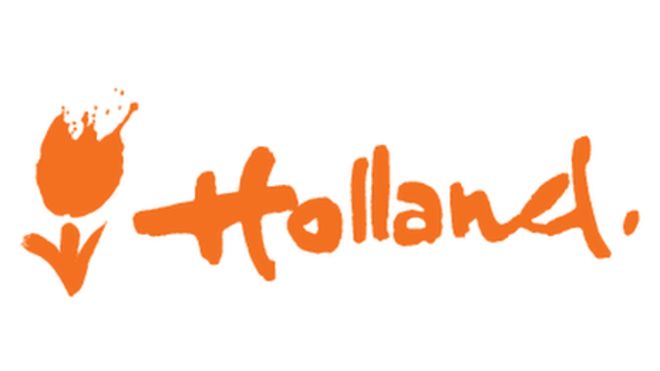
Last month the Dutch Government announced it would be ditching the word “Holland” and be rebranding as “the Netherlands” and today, the Dutch government launched its new international logo. But don’t worry, they got a bargain at only €200,000. That’s right, 200,000 big ones.
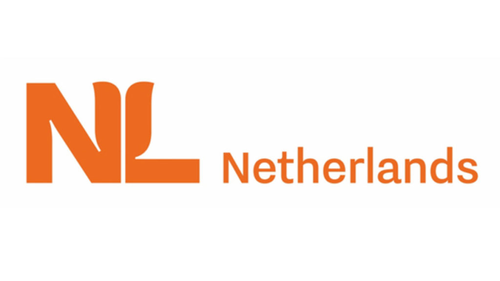
The new symbol
The new symbol will be a capitalised NL with a simple stylised tulip in the middle.
Ministers Kaag, the Foreign Trade Minister and Wiebes, the Economic Affairs minister, thought it was time to revamp and modernise the logo. Kaag thinks this will attract new investors and talent “This is used on every trade mission, you can identify a country here,” she explained.
The logo will start being used from January 2020 by ministries, universities, colleges, municipalities and other organisations that collaborate with the government.
How much did it cost?
This new design cost 200,000 euros. But Kaag justifies this crazy cost by explaining “this is a small investment on a very large government sum to make the earning capacity of the Netherlands abroad as smart and attractive as possible,” NOS reports.
Do you like the new logo? Think it was money well spent? Let us know in the comments below!
Oh dear! This is the sort of nonsense we have come to expect in the UK. I would hope for better in the Netherlands.
The cost is not high as the corporate identity company has to show how to use the logo in endless ways.
But the design is terrible: Lettertype is too thin. Logo type is not pleasant – ditch the tulips!
Cost is cheap compared to corporate rebranding. If the gamble pays off, it will be a bargain. But if the logo flops, it’s a waste of money. Let’s see if it catches on!