In everything from fashion to industrial design, Dutch design has been characterised by both minimalism and unconventionality. Join us in counting down to Dutch Design Week 2023 with a look at what Dutch design has been — and what we expect it to become.
To do this, let’s talk about what’s old, what’s new, and what’s moving on the design scene of the lowlands.
Aftellen (count down) to Dutch Design Week 2023
The best way to understand Dutch design is to experience it — with your eyes, ears, hands, and feet. And what better way to do this than attending the biggest design event in northern Europe?
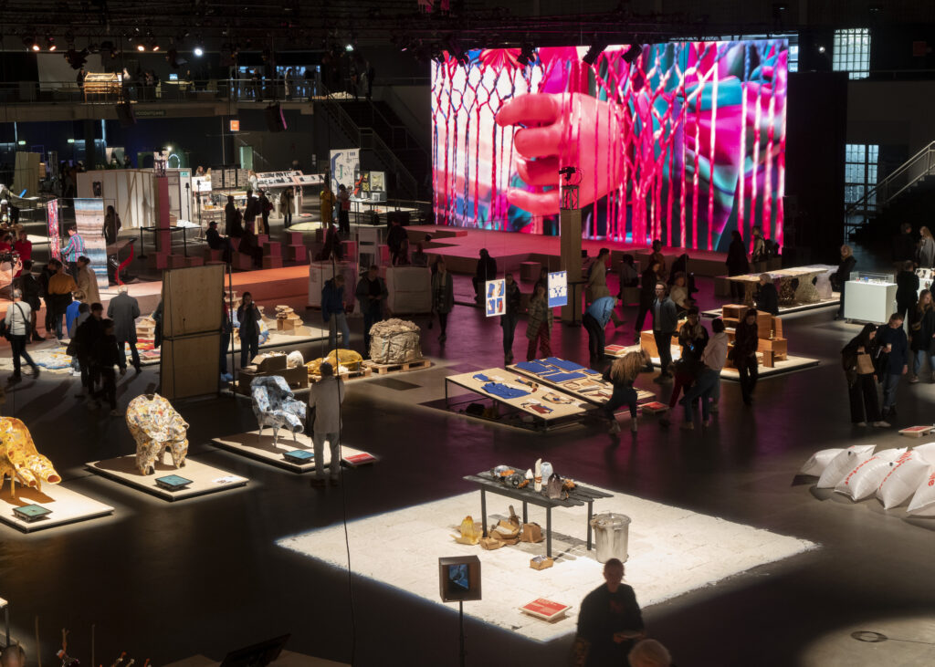
In 2022, the Dutch Design week in Eindhoven covered a baffling 100 unique locations, and hosted talents from all across the country to explore the theme of “Get Set.”
READ MORE | 9 completely free art experiences in the Netherlands
Last year’s edition of Design Week was focused on “moving from preparation to action.” It was all about creating a shift in mentality and outlook — preparing for the future in more ways than one.
In other words, it’s no wonder the week was be crowded with youngsters and undiscovered talents.
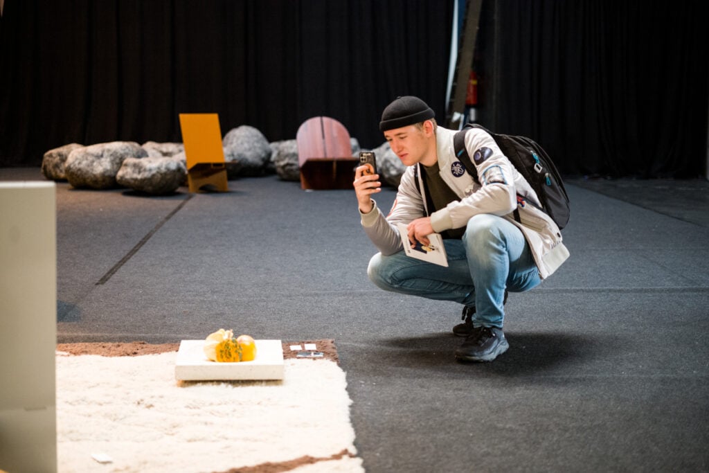
However, before we can delve head-first into the world of contemporary design, let’s take a trip down memory lane and refresh our knowledge about the history of Dutch design.
The historie (history) of Dutch design
Although the term “Dutch design” was only properly coined in the 1990s, Dutch design has a rich history, reaching back decades, if not centuries. The experimental and down-to-earth Dutchies have influenced the design world from the Netherlands in a wide range of ways.
The vroege (early) beginnings: Dutch design in the early 20th century
Some might argue that the roots of Dutch design go back way further than the 20th century — that Dutch design is part of the very soul of society in the Netherlands.
The Art Nouveau movement
Still, the most characteristic Dutch design influences originate in the late 19th century, in the context of the international Art Nouveau movement.
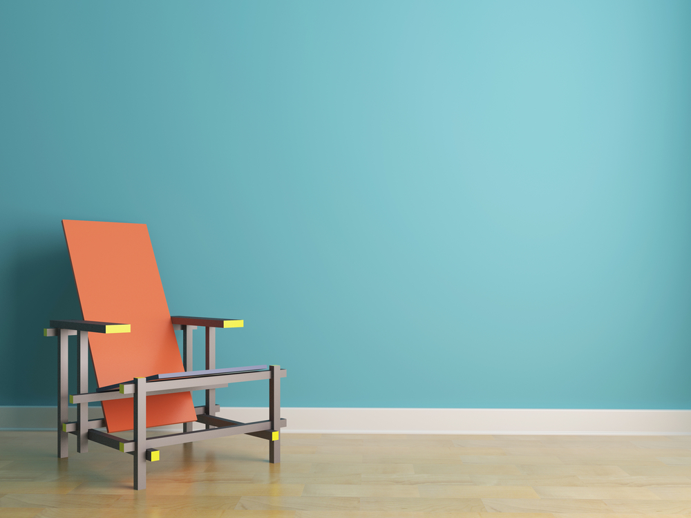
The Dutch twist on the international wave was termed Nieuwe Kunst (new art) and established its focus on geometry, and sturdy handcraft.
Colonial influences
The early 20th-century Dutch design was also heavily influenced by (alternatively, appropriated from) indigenous cultures in the Netherlands’ colonies across the globe at the time.
Examples include, but are not limited to, the Indonesian Batik technique, which influenced much of the characteristic two-dimensionality of Dutch design.
The introduction of De Stijl
In the early 20th century, the new art wave of the Netherlands was driven forward and moved in a different direction from the intricate Art Deco stand. This was thanks to Theo van Doesburg’s establishment of De Stijl.
De Stijl was a movement characterised by abstraction and geometrical shapes, with a strong preference for clean-cut, primary colours.
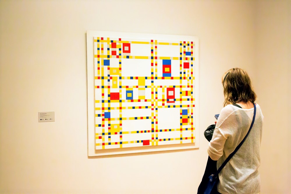
To this day, Mondrian’s simple, structured square compositions are recognisable across the world as beacons of Dutch design and artistic innovation.
Still going sterk (strong): Dutch design in the mid to late 20th century
Dutch design continued into the 20th century by embracing modernism, with the core foundation that art should serve society, and contribute to a better world through architecture, fashion, and graphic design.
With the industrial influences of the 20th century at its core, the Dutch aimed at producing simple, practical, and functional designs — good designs of high quality.
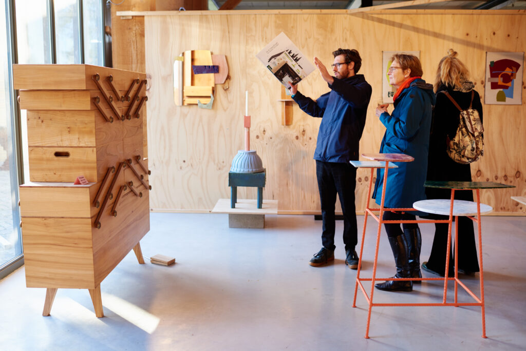
It was all about rejecting the unnecessary and embracing the rationalised economic simplicity that, to a large extent, came to define the world in the mid-20th century.
Further, Dutch mid-century design was, naturally, dominated by the notion of building back a society after the war. This was exemplified by movements such as the Stichting Goed Wonen (Good Living Foundation), aiming to improve the standard of living in the Netherlands through good design.
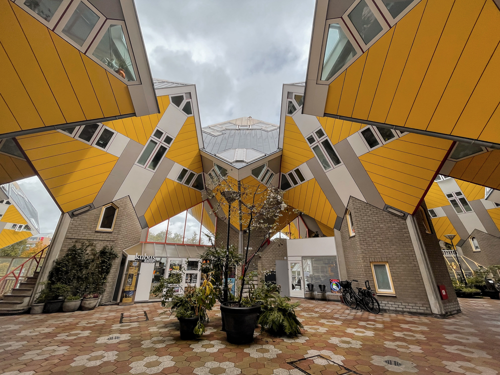
Dutch interior design of this era resembled that of Scandinavian artists’, with its clean lines and simplistic focus. Still, one distinct difference could be found in that the Dutch embraced industrial materials like steel and laminated wood.
At the same time, the Scandinavians, to a larger extent, stayed close to natural materials like wool and leather.
In the later decades of the 1900s, Dutch design was, among other things, associated with the controversial futuristic architecture of Rem Koolhaas, whose complex and deconstructivist approach gained great international recognition.
What’s changing in contemporary Dutch design?
We can’t talk about contemporary Dutch design without mentioning the Droog (dry) design influence of the 1990s.
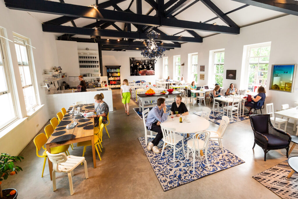
Droog and numerous other designers and groups base their work on the quintessentially dry, blunt Dutch humour, and simple, down-to-earth Dutch way of living.
Sustainability hits the scene
And why are we talking about the past? This typical Dutch impulse of simplicity and high-quality handcraft has recently gained a touch of sustainability and anti-commercialisation.
READ MORE | This Dutch city’s ‘walking’ forest is making the world green with envy
In general, reusing old materials has been a key characteristic of the newer waves of Dutch design, cultivating a certain sense of equality and non-elitism.
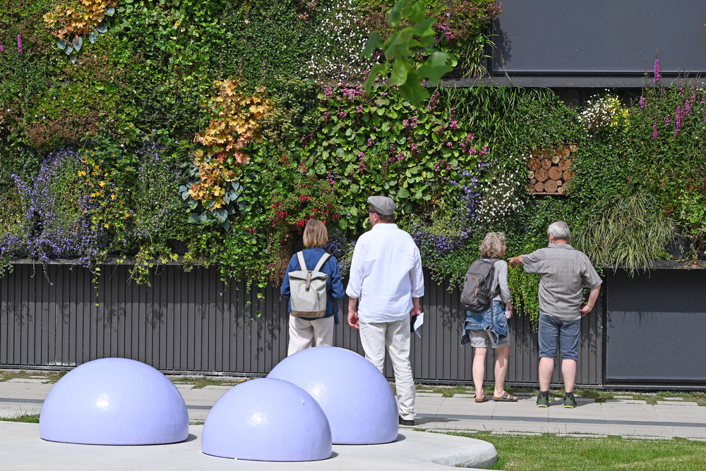
One Dutch artist whose sustainability-focused designs have received much attention is Daan Roosegaarde, with installations like the “smog-free tower” in Rotterdam and the “smart highway” in 2014.
Similarly, albeit more recently, the Floriade Expo in the Netherlands showcased the possibilities related to Dutch design in horticulture — covering everything from biobased material to nature-themed technological installations.
Even at Dutch design week
If you’re interested in exploring more of what’s moving in the world of contemporary Dutch design, few places are more suited to do so than the yearly massive gathering at Dutch Design Week in Eindhoven.
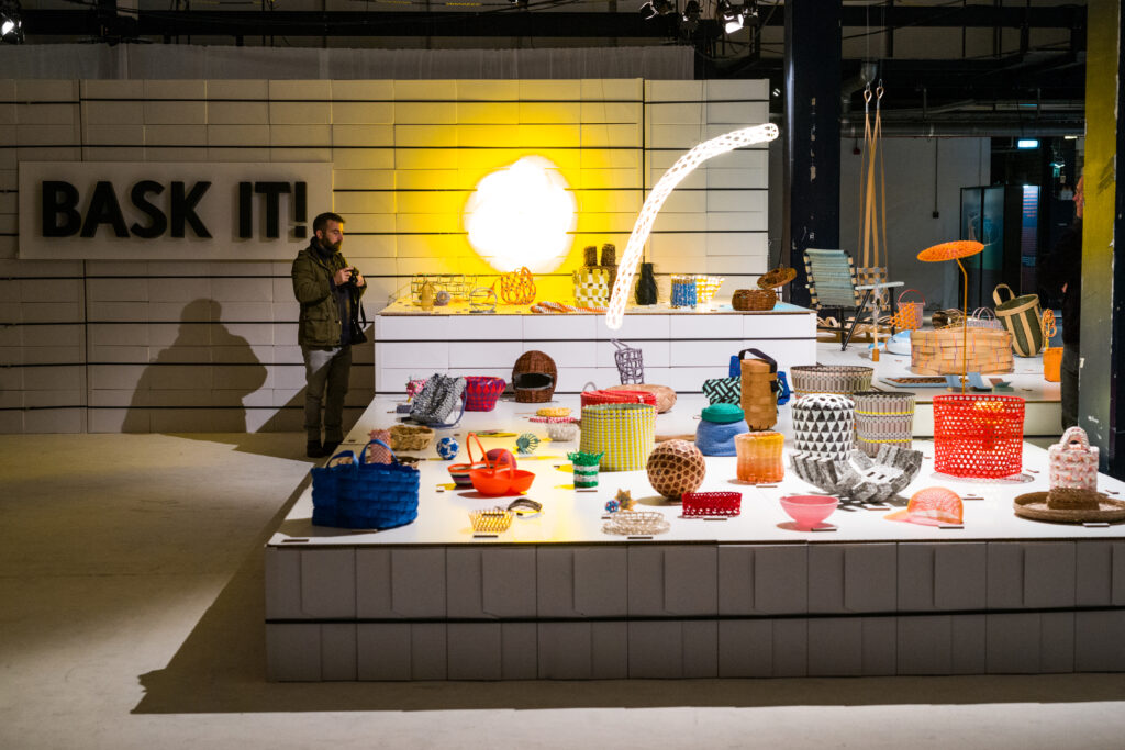
Key areas of 2022 included sustainable product design, the future of cities, and designing societies around inclusivity and well-being.
There were tonnes of creative examples of these themes in the countless exhibitions at DDW, such as Tony Sloof’s “Paved in Gold” project, exploring the increasing scarcity of precious metals in the world.
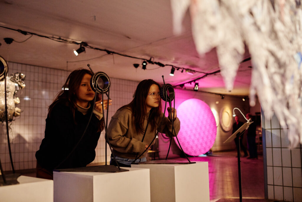
Another exhibition worthy of a mention is Stichting Art-East+Art-West and NARADA Foundation’s hyper-relevant “(HOME)Land. Ukraine”, shedding light on the concept of home, in light of the Russian war against Ukraine this year.
Following another current crisis, the Yksi Expo’s somewhat confronting “Rethinking plastic” exhibition took us by storm with its innovative and fun plastic solutions.
READ MORE | 8 Dutch startups that make the world a better place
Much like the Dutch approach to life, Dutch Design Week is about innovation, function, and good design for good living. And, of course, it’s sprinkled with that down-to-earth, dry, humourous Dutchness that has become so recognisable across the globe.
In other words, at Dutch Design Week this year, you can expect to explore the traditional core tenets of Dutch design, combined with a forward-looking eye at the future.
What do you like the most about Dutch design? Tell us about it in the comments below!

May I make a suggestion? The pale blue captions printed below the pictures is very hard to read. Is it possible to either change the colour or make the print bold like what I am writing in now? Alvast hartelijk bedankt.