
The US State Department has launched a new offensive on the Dutch-designed Calibri typeface.
Since January 2023, officials in America have been using the Calibri font, designed by Dutchman Lucas de Groot, for all official communication.
That is, until December 9, 2025, when Marco Rubio put an end to the Biden-era decision, ordering all communication to return to the Times New Roman typeface.
According to The New York Times, the Secretary of State called Calibri a “wasted step on diversity.”
Lucas de Groot, the Dutchman who designed Calibri, calls Rubio’s decision “sad,” reports NOS.
A more accessible font
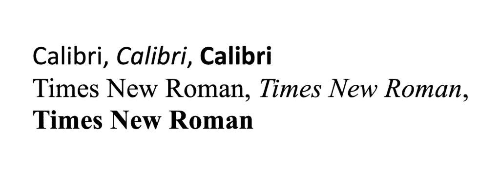
Although Times New Roman was once widely used, its 1990s digital version became “much less suitable for computers,” De Groot tells the NOS.

Serif fonts such as Times New Roman can look very beautiful, he admits. “But they can be distracting and unclear.”
In 2002, the typeface design teacher was commissioned by Microsoft to create a modern and user-friendly font that was easy to read on screens.
Due to its simpler shapes and wider spacing, Calibri is easier to read for people with reading disabilities, such as dyslexia.
That’s why accessibility advocates welcomed the Biden administration’s 2023 switch to Calibri.
Rubio’s love for tradition
Rubio’s directive titled “Return to Tradition…” halted the use of Calibri to “restore decorum and professionalism,” says the memo accessed by The New York Times.
Although many diplomats suffered a blow to their morale since Trump took the reins, the Times New Roman directive fits neatly within his administration’s resistance toward anything DEIA (diversity, equity, inclusion, and accessibility).

But why the nostalgia for Times New Roman? What does the State Department long for so badly that it’s willing to sacrifice clarity and ease of use?
Is it a time with classical federal architecture, picket-fence houses, when women couldn’t vote, racism was rife, and disabilities were taboo?
Perhaps Calibri is indeed “too woke” for an administration led by old, White men.
Health care, food, housing… skyrocketing costs everywhere. But thanks, Trump Administration, for focusing on the real fight: Calibri vs. Times New Roman. pic.twitter.com/Uk8yy7UJj4
— Health Care For America Now! (@HCAN) December 10, 2025
Want the latest Dutch news to come zooming through the internet to your inbox? Dat kan! Subscribe to DutchReview’s weekly roundup 📮