
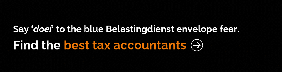
The Dutch government unveiled their new international tourism logo last Friday. In one key difference, they’re now branding as ‘the Netherlands’ instead of ‘Holland’. In another significant change, the new logo sucks – or so Dutch Twitter thinks.
Twitter is heating up and turning some of that infamous Dutch Directness back on the government. The results? Pure gold.
While the new logo incorporates a tulip into the branding, the Dutch just really think that it could have been done better – especially considering the hefty 200,000 euros price tag.
But, according to Minister for Foreign Trade and Development Cooperation Sigrid Kaag, the price tag is ‘very normal’.
“You recognize a country by this,” Minister Kaag told RTLZ. “When it comes to billions of euros and many jobs in the Netherlands, 200,000 euros, as a one-off investment, is a small amount.”
What does Dutch Twitter think?
Needless to say, they’re not impressed. A stack of graphic designers have jumped in critiquing the logo for various graphic design failings, in particular, a lack of symmetry.

“The tulip is not symmetrical. I repeat. The tulip is not symmetrical.”
De tulp is niet symmetrisch. Ik herhaal. De tulp is niet symmetrisch. pic.twitter.com/HFxES995Cn
— Thomas van Groningen (@TvanGroningen) 8 november 2019
“Okay, summary: – ‘the’ is missing – the tulip is not recognizable – the tulip is asymmetrical – the left leg of the left-N is weirdly shaped – the bottom leg of the L is too long – the L looks like a joint – the capital letter N in Netherlands is too small – the t is shorter than the h”
Oke: samenvatting:
– ‘the’ ontbreekt
– de tulp wordt niet herkend
– de tulp is asymmetrisch
– de linkerpoot vd linker-N is raar gevormd
– de liggende poot vd L is te lang
– de L lijkt een joint
– de hoofdletter N in Netherlands is te klein
– de t is korter dan de h pic.twitter.com/2To25aJjpW— Paula Steenwinkel ?️? (@PSteenwinkel) 8 november 2019
Some people pointed out that perhaps the tulip, which originally hails from Turkey, was perhaps not the most representative of the Netherlands. They had some other ideas.
“The Netherlands has a new logo. We are no longer the land of tulips. The N and L together form a chimney.”
Nederland heeft een nieuw logo. Niet langer zijn we het land van tulpen. De N en L vormen samen een schoorsteen. pic.twitter.com/hSwru0P4LC
— Nicolaas Immers (@ImmersNicolaas) 9 november 2019
Or perhaps a different kind of smoke.
— Peter Klaassen (@pwklaassen) 9 november 2019
We think this one will really appeal to all the teenagers who buy t-shirts from street vendors.
“My entry didn’t make it …”
Mijn inzending heeft het niet gehaald… pic.twitter.com/ZaIkSjDvpK
— VJ Slof (@slolov) 8 november 2019
It’s always important with these kinds of investments to ensure that the logo will remain current for years to come. Thanks @BirdUtterance!
“I have made the logo future-proof:”
Ik heb het logo toekomstbestendig gemaakt: pic.twitter.com/vxkYQj7jI0
— nyolc (@birdutterance) 9 november 2019
And some of the new suggestions are downright rude, but we’re putting it in here anyway. Who are we to block creative freedom?
— Robbie (@Robbie_NP65) 10 november 2019
Despite the government announcing the rebrand from ‘Holland’ to ‘the Netherlands’ they appear to have forgotten the ‘the’ in the final copy.
Tweehonderdduizend euro voor een foeilelijk logo en dan de naam van het land nog verkeerd schrijven ook. #THEnetherlands pic.twitter.com/DlKgRe2tMR
— Thomas Heij (@ThomasHeij) 8 november 2019
But we like this one better anyway.
Nederland heeft een nieuw logo. Nederlanders gaan los. Ik nam ook even de tijd #Logo #Nederland (met de ‘the’ van @rhalverhout #mooiesuggestie) #tulplogo #logo_design #vormgeven #suggestie #variatie #smakenverschillen #Holland pic.twitter.com/0lWE903fo0
— Diane Agteresch (@Diane8rs) 9 november 2019
What do you think of the new Dutch logo? Stunningly designed and well worth the money? Or could you have done better on the Windows 98 version of Paint? Let us know in the comments below!
Actually there’s been worse. I vividly remember a Dutch tourism campaign from the late 80s with the slogan “Holland’s got it” and an erect penis as a backdrop. For real. This was in some naughty magazine, so I’d guess there were also SFW variants using the same slogan.
Out of curiosity, can anyone else remember this campaign? I can’t find it on Google to have “hard” proof for it.
I prefer the old one. However, many tourists don’t even realize that Holland is only a part of The Netherlands. I like the old one because it elicits that strong connection to the fabulous art and museums. Nou ja dan.
Every Dutch thinks he is a designer. As well as a judge, football coach, doctor, teacher, pilot, ceo, scientist and farmer.
Does anyone really think that the choice between ‘Netherlands’ and ‘the Netherlands’ or ‘The Netherlands’ was not considered at some point in the process?
The width of the L, the spacing between N and L, the curves at the top of the tulip; with contemporary software it is incredibly easy to consider all possible variations.
‘The tulip isn’t symmetrical’ is a good example of the Dunning–Kruger effect.
1) Tulips aren’t symmetrical and
2) unnecessary symmetry is boring.