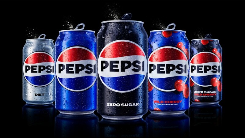
Red, white and blue stripes — what does that make you think of? The Dutch flag? Well, now it’ll make you think of the new Pepsi logo.
Pepsi unveiled a new logo ahead of its 125-year anniversary, and we can’t say we haven’t seen it before. 👀
What makes it look like the flag of the Netherlands? It’s the horizontal layout and more vibrant colours, particularly the blue.
READ MORE | Dutch Quirk #88: Hang their school backpack on their house flagpole after graduating
More contemporary
The goal in reimagining the logo was to infuse “great energy, confidence, and boldness”, said Mauro Porcini, chief design officer of PepsiCo, in a press release.
PepsiCo said that the more vibrant blue and black would bring a “contemporary edge” to the colour scheme of the brand. We guess we can take that as a compliment to the Dutch flag. 😏
The new design is also incorporating the colour black to show dedication to Pepsi Zero Sugar in the future. This, with other new modern elements such as a new can silhouette, will embrace the brand’s heritage and help the brand succeed digitally.
Pepsi accidentally goes Dutch
And we aren’t the only ones to notice the new logo’s similarity to the Dutch flag.
The new logo just reminds me of the Netherlands flag with “Pepsi” on the middle— César López (@Cesarlopca) March 29, 2023
The Netherlands colonized the new pepsi logo aw hell nah https://t.co/iMbkshYUc5 pic.twitter.com/FQ9jLSqKJy— End (@Endeeznutz) March 29, 2023
The Pepsi logo has looked similar to the Dutch flag before. Consumer research showed that Pepsi consumers preferred the logo from the 70s and 80s. Older logos then inspired the new logo.
Pepsi’s logos throughout the years: pic.twitter.com/e2fZki2xvB— Pop Base (@PopBase) March 28, 2023
The new logo will start making appearances in the U.S. and Canada later this year, and will roll out internationally in 2024.
What do you think of the new Pepsi logo and its similarity to the Dutch flag? Tell us in the comments.


